Helsinki Guggenheim
Museum
This proposal for the Helsinki Guggenheim combines two key elements of the contemporary art viewing experience: the grand concourse for large-scale installations and activities, and the intimate gallery in which highly specific exhibitions can be framed and staged.
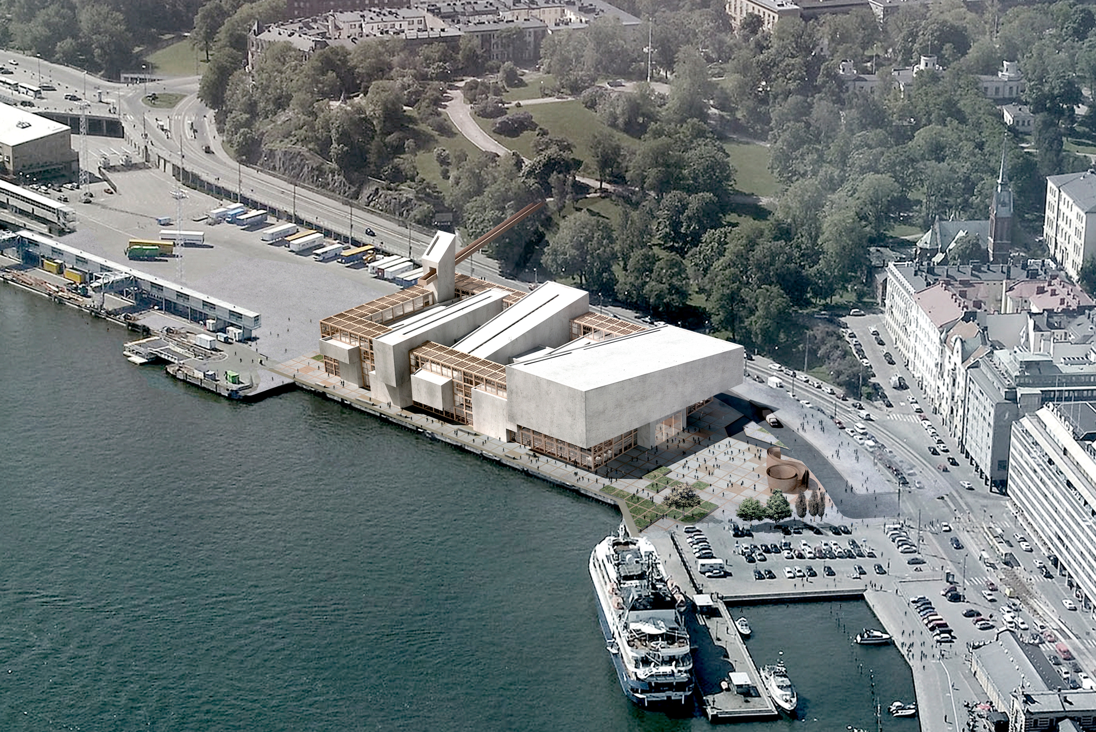
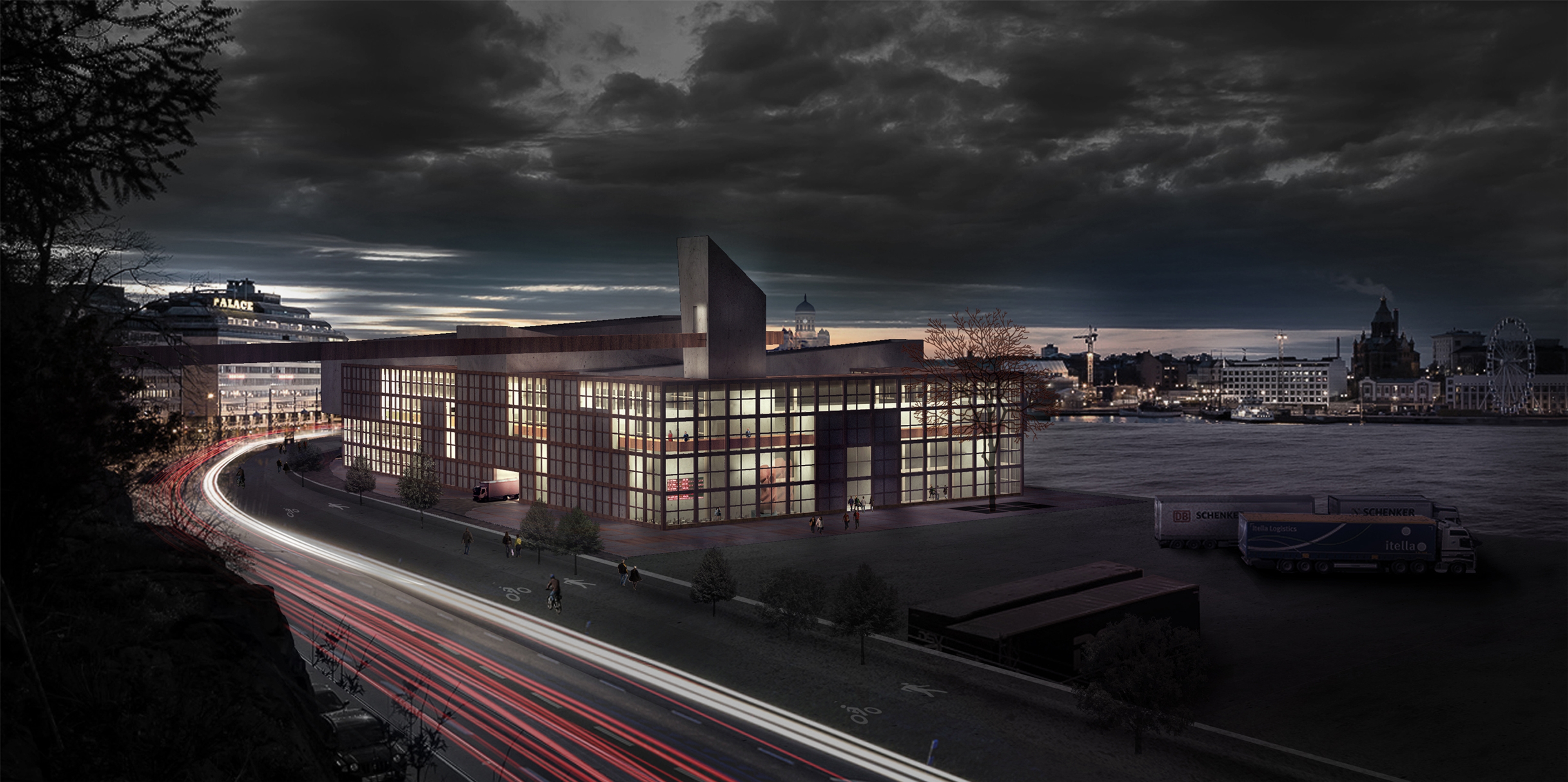
Typically, smaller gallery spaces are nested within the larger form of the museum, unseen to the public eye. In this case, they define the architecture, establishing a strong presence along Helsinki’s South Harbor by creating a new rhythm of masses instead of dominating with a single shape. On the interior, a triple-height public concourse cuts through the entire length of the building, connecting the outdoor plaza to the north with the ferry terminal to the south of the site. It functions not only as a lobby and gathering space, but a public exhibition hall, complemented by a ring of services that runs around the perimeter. These include ticketing, retail, and dining programs along the waterfront side for museum visitors as well as private service space, such as office, loading and storage for museum employees. This ring, constructed out of a wood frame and glass panels, allows for an abundance of natural light and views out to the harbor.
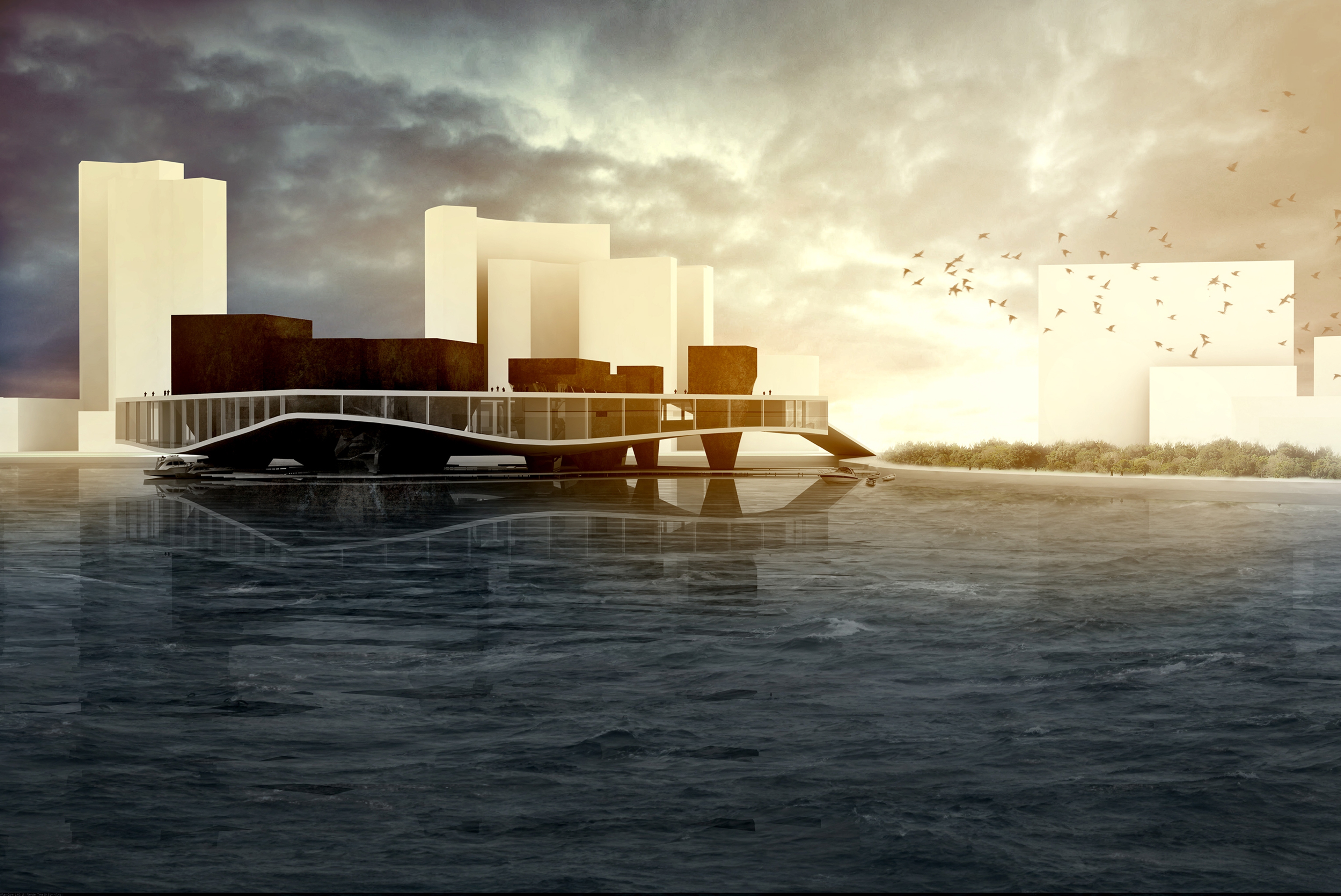
The wood frame and concrete gallery boxes are in constant dialogue with one another. From afar, the frame’s grid pattern is like a thin screen that envelops a collection of solid boxes, a light counterpoint to the solidity of the boxes. Upon getting closer, however, the ways in which the gallery boxes respond to the particularities of the site become apparent. Along the waterfront edge, they extend and recede at variable lengths to animate the water’s edge and provide shaded areas for potential pedestrian activities. In contrast, they remain flush with the structural frame on the western edge of the site in response to the regularity of existing facades in the surrounding context. The largest gallery box is placed on the north side to establish the museum entrance, while a view tower rises to the south with a pedestrian bridge connection to the park. The roof, visible from the park, highlights the dynamism between the boxes and the frame.

Where the primary circulation functions as a central path on the ground floor, it flips to occupy the periphery on the upper floor. A continuous bridge runs through each of the five gallery spaces, connecting them in a large loop. Each gallery interior alternates with views onto the harbor, and thus the site is integrated and interspersed through the gallery sequence as if it were simply another canvas on the wall. It provides huge potential in curating specific narratives for exhibitions, but can easily control access in case of special exhibitions. Where the intersection of the gallery boxes creates interior courtyards at the ground level, it leaves space on the upper levels for views down onto the grand concourse below, stimulating overlaps between different audiences and enriching the art viewing experience.


